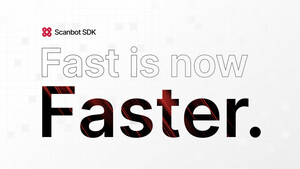
Scanbot SDK has adopted a new design system, completely revamping its website and company logo.
BOON, Germany, Sept. 6, 2023 /PRNewswire/ -- The company launched in 2011 with the aim of revolutionizing document management. In 2014, it introduced the consumer document scanning app "Scanbot". A B2B scanning solution, the Scanbot Software Development Kit (SDK), followed in 2017. Building on the latter's success, the company has catered exclusively to the needs of businesses since 2020.
Christoph Wagner, CEO of Scanbot SDK, explains the motivation for the design change: "The strategic shift from B2C to B2B allowed us to concentrate on high-quality, reliable solutions for businesses. Today, we are proud to count many industry-leading companies among our customers, including DocuSign, Deutsche Bahn, Deutsche Telekom, AXA, Aflac, Motive and Rimi Baltic. Their trust is a testament to the quality and reliability of our products. We try to reflect that with our new brand design."
The first aspect of the new design is a new color palette. While keeping the signature Scanbot SDK red, the company introduced five functional colors. These help communicate important information or actions to users.
The next change concerns the brand's typography: Scanbot SDK is moving from Fira Sans, a casual typeface, to Inter, a more formal and robust typeface. Inter is a sans-serif font designed for high legibility on screens of all sizes.
The last piece of Scanbot SDK's rebranding efforts is its new company logo. It consists of four circles in the company's signature red and contains right angle shapes that together evoke a camera viewfinder. The whitespace between the circles resembles a camera flash. These details encapsulate what Scanbot SDK is all about: enabling fast and accurate data capture and extraction. The new logo enhances the company's recognizability and clearly positions Scanbot SDK as a trusted entity in the B2B space.
Christoph Wagner concludes: "This rebrand is more than just a visual makeover. It reflects our continual evolution and our commitment to a first-class user experience. We are excited to see this new visual identity bring a fresh perspective to our brand and resonate with our clients."
All these changes are also reflected in the redesign of the Scanbot SDK website, which features a fresh look and feel as well as improved usability: https://scanbot.io.
Logo - https://mma.prnewswire.com/media/2201400/Scanbot_RedBlack_Logo.jpg
Photo - https://mma.prnewswire.com/media/2201401/Scanbot_New_Brand_Design.jpg
Contact: Niklas Kreck
press@scanbot.io
+49 (0)228 94800044


Share this article